Friday, 1 February 2019

Sennen Cove beach at sunset

Recently I happened to be talking to one of the rare people who actually take time to read this blog (occasionally), and they said something along the lines of: "[Almost] no-one reads your blog so you should post some of your paintings -- no-one will see them!" Point taken, although not exactly encouraging... (Apparently, I post mostly rants?) So here is one example of a painting.

It is what I consider to be my eighth (beginner's) painting and was completed last summer during a very warm week off work. It is largely based on a photograph that I took on the beach at Sennen Cove in West Cornwall, England in September 2008. (This was my first visit to Sennen Cove -- I have been back many times since, as it is such an amazing location in all weathers and times of the year.) I suppose it could depict a beach in a number of places on the planet in all honesty, as nothing particular shouts Sennen Cove.

I was thinking: when one's eye is drawn to a picture, it is due to the subject matter, or the composition, or the lighting, or the colour, or the artistry, or some combination of all of these. Not -- ooh, I wonder whether the painter used "Brand X" paint, or "Brand Y" brushes? So I can't really understand why people spend so much time discussing (arguing?) the merits of different brands, as it is the final product that matters. Whatever works for you. (In the case of watercolour, the paper itself is the most apparent feature. How many people would be able to identify the manufacturer by looking at a finished painting? Would they like the painting less if they discovered that it was painted on paper that they considered to be inferior?)

Time to nail my colours (paints?) to the mast, so to speak! On the basis of previous blog postings, it would be hypocritical not to say that I used Cotman watercolours. I did -- exclusively. Not that it really matters, but I would have used Intense Blue and Cadmium Red Pale Hue for the sky, Intense Blue, Viridian Hue, Cadmium Yellow Pale Hue and Cadmium Red Pale Hue for the sea; and different combinations of Ultramarine, Burnt Sienna, Burnt Umber and Yellow Ochre for the beach. I can't remember details of the brushes (I have too many), but I'm sure I would have used at least one Escoda Versatil round at some stage, as they work well for me without costing a small fortune.

The paper was Ken Bromley Practice Paper, AKA Fabriano Watercolour paper (cut down to one eighth of an Imperial sheet). This is 130 lbs in thickness, supposedly 25 percent cotton, and comes in a Not surface -- probably its most distinctive feature. I used moistened brown gummed paper tape to help stretch it and fix it to an A4-sized piece of 6 mm thick plywood that had previously been painted white. Ken Bromley Masking Fluid was used for lighter areas in the waves: I had no problem removing it when it was dry. I was fairly pleased with how the painting turned out, although I don't like the regular texture of the paper, and I had to be careful to avoid overworking it. (I find that Bockingford paper is more amenable to my present lack of technique and experience.)

Tuesday, 1 January 2019

The Archie search engine: I was there...

On 11th (some sources say 10th) September 1990, a small team of people from McGill University in Montreal, Canada released what is generally recognised as the world's first internet search engine. It was called archie. The team members were Alan Emtage, (J) Peter Deutsch, Bill Heelan and Mike (der Mouse) Parker. As surprising as it may seem, I used to work with these clever people and regarded them as my friends. But I played no part in the development of archie. Or did I?

My story starts in Montreal in 1986 at a small hi-tech company called MUX LAB, where Peter and I were working as part of a small team of programmers developing a product called ACCESS 36. (I still have a copy of the user manual.) It was both a rewarding and a frustrating experience at times, and after a few incomprehensible management decisions, Peter left to work on his Master's degree at McGill full-time. My time at MUX LAB came to an end in early September 1987 -- I should have seen it coming...

About the same time, the post of System Manager at McGill's School of Computer Science had become vacant, and it was offered to Peter -- which he accepted. Not long afterwards, knowing of my lack of employment, Peter asked me whether I would like to work for him as a (Unix) systems administrator. As the saying goes, the rest is history! I was delighted to accept, although I knew it would be a steep learning curve. Peter was already assisted part-time by Luc, whom I also knew from my stint at MUX LAB, and who was also working on his Master's degree. At that time, the School of Computer Science was located on the eighth and ninth floors of Burnside Hall on McGill's downtown campus.

The first few months were challenging but by early 1988 Peter was looking to expand the team. If I remember correctly, Bill came recommended by a friend of mine (Stephen) at Concordia University. One of my earliest memories of working with Bill was helping to set up and configure a new Sun 3/280 server by booting it from a remote 1/2" tape drive. Based on Bill's recommendation to Peter, Wanda joined the team in late spring or early summer of 1988. And by the summer, Alan had swelled our ranks -- although I think it might have been earlier as he shared an office with Luc, separate from the full-time staff.

One probable reason for the relatively sudden increase in staff numbers was that The School of Computer Science (SOCS) was to be relocated to the McConnell Engineering Building, into newly refurbished spaces on the second and third floors. The SOCS system staff were responsible for all the computers, serial cabling and most of the network cabling. So it turned out to be a very busy summer running and terminating cables, getting everything ready, and then moving everything into new rooms and offices.

By 1989, we were settled in to Engineering and the pace of life seemed to slow down to more of a routine. Frankly, and in retrospect, we were over-staffed for the size and complexity of the School at the time. But they were ideal conditions for what was to come.

As has been related elsewhere, Alan had accumulated a number of large files listing the contents of Internet download sites. (I have a feeling that I grumbled when I discovered that some of them had appeared on the server milo that I used to maintain!) In time and quite logically, this transformed into the archie project, and then took off. Peter announced that we were welcome to volunteer to work on the project, but I remember thinking that most of the (interesting) programming was already underway and I didn't think I could contribute anything useful. (Where was the crystal ball when you needed it, eh?) Bill's desk was adjacent to mine so I was aware that he was working on the user interface, and was inspired by the VMS shell that he had used at Concordia. I remember hearing Alan talk about memory mapping as a way to speed up database access. Mike (Mouse) was based in McCRIM a couple of floors above, and was our friendly local Unix guru who would drop by regularly and offer advice.

So I made no direct contribution to archie that I can remember. However, I did once solve a problem that was causing the archie server (a Sun 4/280 running SunOS 4.1 I think?) to crash fairly frequently while under load. I believe it was Luc who came to see me with error messages from the server log files. It looked as though it was related to the serial ports. This rang a bell: the fix was to physically disconnect the DB25 plugs (still cabled-up to the patch panel) from the serial ports on the server. I then heard that this seemed to help with extending the uptime...

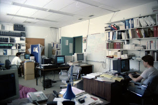
This all happened long before the arrival of consumer digital photography. I had taken a few photos of the work environment on colour print film, and a couple of the most relevant appear here. (Apologies for the general low quality: an inexpensive all-manual SLR and matching lens.) The top picture shows an out-of-focus (oops) Bill (L) and Peter (R), and was taken around the spring of 1988 in the old Burnside Hall office. The photo of Wanda (L) and Bill (R), taken from my desk, dates from the summer of 1991 and shows the office where a good proportion of the archie discussion and development took place. Alan would sometimes use the desk in the centre of the photo as his office was next door. (I thought I had a photo of Alan, but nothing has come to light yet. I'm fairly sure that I didn't take any pictures of Mouse.)

My former colleagues, wherever they are now, may remember things a little differently -- some of the events mentioned happened more than 30 years ago, and memory can be unreliable. I felt it would be useful to record a little more detail about the background and context of the creation of archie as I still recall it. (Some of the references I have found about it are misleading or inaccurate!) I am of course proud of the achievement of my former sys. admin. team members: at the time, none of us suspected how it would change the world!

Monday, 3 December 2018

The IKEA Hemsjo candle

It is now officially the season of Advent. For most of my earliest years, candles at Advent played a big part in the lead up to Christmas. (They still evoke many fond memories at this time of year.) Mainly, they were red taper candles for the Advent wreath -- one new candle would be lit each Sunday, until we had all four burning on the last Sunday before Christmas. (Of course, my sister and I had our Advent calendars too!) But I digress.

The four candles I want to mention come from IKEA in a pack labelled Hemsjo. (The O should have an umlaut above it.) All four cost me a modest £1.75. Each candle is 5.7 centimetres (57 millimetres) in diameter and stands 8 centimetres (80 millimetres) high, including the conical top. They are all unscented and white. An individual candle is rated at 15 hours of (continuous?) burning, so the whole pack should be good for at least 60 hours when lit consecutively. On a price per candle basis, they appear to be the cheapest pillar candle (IKEA calls them block candles) in their range, working out at £0.44 each.

As budget pillar candles, how do they perform? Well, as you might expect from the price, they need a little bit of effort to get the best out of them. I have found that they are definitely not light and forget, as this results in an excessive candle flame and a tendency to burn down too quickly ("funnel"). I would say that they are slightly under-wicked -- but it is safer to have them under- rather than over-wicked. With a little care you should certainly be able to exceed the stated burn time.

Going on the 30 minutes of burning per centimetre of diameter rule-of-thumb, and rounding up, this gives a single lighting duration of near enough three hours. I always trim the wick before starting, and Hemsjo seems to work best when I start with the wick at 3 millimetres (1/8 inch). (From experience, it is a bit of an art to set the starting wick length based on both the thickness of the wick and the diameter of the candle: it is usually somewhere between 3 and 6 millimetres on most household candles!)

Although it looks aesthetically pleasing, the conical top makes initial lighting a little more challenging. Due to the slope, the candle burns down quickly, resulting in a long wick that consumes wax at a faster rate -- and then it starts to funnel! When starting a new candle, I have tried limiting the first burn to one hour, but even this proved to be too long. I shall try 30 minutes next time! (A more drastic solution might be to slice the conical top off?)

The wick is not anchored to the base of the candle in any way. (Some more expensive candles sometimes have a metal tag attached to the end of the wick.) What I have discovered is that further down the wick is markedly off-centre, and eventually it will collapse and drown in the melt pool. This is a good thing (safety again), but it does mean that the last centimetre or so of candle won't be consumed.

Unscented candles normally have no noticeable smell to me, but I have sometimes detected a faint paraffin odour after burning a Hemsjo candle for three hours. I don't find it offensive but I thought I should note it. I suspect it is down to the price: you get what you pay for, and all that...

Otherwise, I think that the IKEA Hemsjo candle is good value, and with a little attention burns reliably and with few surprises. This must be true: I have bought four packs so far and have already started on my second. Now if only they sold them in red for Christmas...

Saturday, 10 November 2018

Ken Bromley Practice Paper

One slightly daunting aspect of watercolour painting for a beginner is the cost of the paper. Even at competitive prices, a quarter imperial (11" x 15") piece of quality watercolour paper will cost around a pound sterling (UK), so a serious mistake hurts a little in the financial department. Risk can be lowered by dividing the paper into eighth and sixteenth sheets, but this is not conducive to a looser painting style using larger brushes.

I have been a customer of Ken Bromley Art Supplies for a few years and it didn't take me too long to notice that they sell a 50-sheet quarter imperial pack of practice paper, at around 30 pence a sheet. The paper is Fabriano 280 gsm watercolour paper in a Not surface, which works out to 134 lb thickness. This is about a third of the price of popular 140 lb watercolour papers and is worth considering as a practice surface if you are not too worried about the outcome. Even the reasonably-priced Bockingford paper still works out to be more expensive in this quantity.

One mystery -- and what attracted me to the paper in the first place -- is the cotton content? Going by the Ken Bromley catalogue at the time, it appeared to be a full cotton paper. But I think this referred to a paper that is no longer sold. A couple of internet sources suggest that there might be a 25 percent cotton content, but I'm still not sure!

I duly ordered a pack and it soon turned up in the post thanks to Ken Bromley's usual efficient and prompt service. I chose to divide up some of the sheets into halves and quarters. I used the sixteenth (imperial) sheets for experimentation and testing, as well as a few finished paintings. The larger eighth sheets were used for paintings only, including a test to see how it behaved when stretched.

The first thing that struck me was the very regular pattern left on each side by the paper making process. It looks as though a wire mesh (screen) was used on both front and back, unlike the woollen felt normally used on the front of other papers. It is therefore very difficult to determine which side of the paper is the front, and which side is the back. (It probably doesn't matter very much!) The texture is also why Jacksons Art doesn't recommend this paper for finished works.

Notwithstanding the regular texture, how did it respond to paint? Well, as someone who is still very much at the learning stage, I found that it was a challenging surface. It did not appear to be heavily sized and was more absorbent than other papers I have used. Consequently I had difficulty lifting some paints, especially staining ones. Too much water and over working caused the surface of the paper to break up. And yes, it did cockle substantially after heavy washes if it wasn't stretched.

The absorbency and reaction to water meant that achieving a plausible cloudy sky was an effort in itself! (Mine have been hit and miss -- mostly miss.) I think that pre-wetting, then a heavy wash followed by quick work with absorbent material may yield the best results.

Perhaps I was lucky with my method, but the paper did seem to behave better after it had been stretched. (I used standard brown tape on a plywood board.) I felt more confident using larger amounts of water and wetter washes, and even though the paper would still lightly cockle, it would always return to its stretched state once dry. This seems to validate the recommendation to stretch paper of 140 lb weight and lighter.

This practice paper definitely fills a niche, but may be best for painters already confident with their technique and wanting to get some brush mileage behind them. I would still recommend something like Bockingford for beginner and inexperienced painters, as it is a harder wearing surface that stands up better to repeated working.

Monday, 1 October 2018

Watercolour paper: rag or wood pulp?

I recently discovered that the watercolour paper that I had been using (Ken Bromley's Practice Paper) -- actually Fabriano 130 lb Watercolour paper -- did not contain the proportion of cotton fibres that I originally believed to be the case. (Depending on the source, it could be either none at all, or 25 percent.) I know that most references and commentators stress the use of 100 percent rag (or cotton fibre) papers for watercolour, but is this just another oft-repeated mantra when there are some less expensive but almost as effective alternatives?

Wikipedia says that cotton is nearly 100 percent cellulose. Paper made from wood pulp should also be nearly 100 percent cellulose, as the claim is that it has been processed to remove the lignin and acid that causes it to turn yellow. The main difference between the two types of paper is that the cellulose fibres in the rag paper are longer, therefore making the paper stronger, more resistant to water, and a better surface to paint on. (It is not obvious that the cost of making a pure cotton paper explains the significant difference in price to consumers, however.)

The "sizing" of paper also has a bearing on how it works as a painting surface. Sizing is a substance used to control the absorption of a paper: gelatine is frequently used in manufacture. The most expensive papers appear to be both internally and externally sized. There is hard sizing and soft sizing. Hard-sized papers are most resistant to water and are best for some wet-in-wet techniques, whereas a soft-sized paper may not stand up well to repeated working.

Labelling on watercolour papers will give dimensions, weight and surface texture as standard. Most seem to claim 100 percent acid-free. Some will say archival, but what does this actually mean? Details such as composition and type of sizing can be harder to discover, although the degree of cotton fibre content is usually a selling point. And the price compared to other papers is usually a good clue.

The reality is that there is no (international) standard for watercolour paper, so the painter has to trust that the paper is fit for purpose and is what the manufacturer claims it to be. Consumers have to go on trust that the artwork will look as good on it a century (or more) later. How many people have the necessary equipment and knowledge to test that a paper is made of 100 percent cotton fibres and will not lose its original brightness after a hundred years? Do watercolour paper manufacturers actually do this? From a price point of view, I would expect Arches Aquarelle paper to be a better long-term investment than St Cuthbert's Mill Bockingford paper, but do we know if this is true?

I am still learning and experimenting. It would certainly be foolish to use a paper that is not labelled for use with watercolour. When I find a paper that seems to suit the way I (try to) paint, I will probably go with that -- assuming I can afford it in quantity. The chances are that it will be 100 percent cotton, but I am not ruling out something like Bockingford either. When I'm gone, do you think that the people disposing of my effects will care whether the paper is derived from cotton or wood pulp? ;-)

Saturday, 1 September 2018

A watercolour secondary palette

When I first got interested in watercolours in the late 1980s, one of the many things that I found bewildering at the time was the question of which colours I needed? My sole reference book back then listed a number of manufacturers supplying a multitude of paints, but had no clear recommendation about what a beginner should start with!  I remembered from distant school days that red, yellow and blue were (supposed to be) primary colours, so why did I need a palette containing a dozen (or more) different paints?

I have since learnt that in watercolour painting, the use of the split primary palette is fairly well established. This takes my three primary colours listed above, and splits them into cool and warm -- so a cool red and a warm red, a cool yellow and a warm yellow, and a cool blue and a warm blue. But then it seems to get complicated when you start mixing them together. For example, I guess that green should be mixed from a cool yellow and a cool blue, but what if a warm colour is used instead?

Presumably with practice it becomes second nature to mix colours using a split primary palette? However, this does seem to raise the bar -- unnecessarily? -- for beginners, who may struggle with colour theory as it is often presented. Perhaps this helps to explain why some people use palettes with a large number of colours, as it is too much of a chore to mix them from primaries? (I have ignored the discussion of staining and granulating pigments, as that is another dimension!)

In the course of browsing the Handprint pages, I discovered the idea of using a secondary palette instead. This made a lot of sense to me. No longer did I need to worry about whether I needed to use the cool or warm primary colour, because the primaries had been changed to three that I recognised from computer colour printing (cyan, magenta, yellow [CMY]), and three secondary colours had been introduced (red-orange, green, blue-violet). Furthermore, the gamut of the palette had been increased -- especially for greens.

I was then pleased to find out that the selection of paints in my Cotman Sketchers' Pocket Box readily lent themselves to a secondary palette: Cadmium Yellow Hue would be primary yellow, Cadmium Red Pale Hue would be secondary red-orange, Alizarin Crimson Hue would be primary magenta, Ultramarine would be secondary blue-violet, Intense Blue would be primary cyan, and Viridian Hue would be secondary green.

Further reading of the Handprint pages led to more specific recommendations of primaries and secondaries. Restricting myself to the Winsor and Newton Cotman range, I replaced Cadmium Yellow Hue with Cadmium Yellow Pale Hue, and Alizarin Crimson Hue with Permanent Rose to closer match the suggestions. The Cotman Intense Blue is PB15 rather than the PB15:3 (Phthalo Blue Green Shade) that is suggested, but I was happy with that. If I was fussy about single pigment paints, then Winsor Yellow and Winsor Orange (Red shade) from the W&N Professional range would need to replace the Cotman Cadmium Yellow Pale Hue and Cadmium Red Pale Hue respectively. (I have since found that the Daniel Smith Transparent Pyrrol Orange gives a closer match to Cadmium Red Pale Hue than Winsor Orange (Red Shade).)

I have been regularly using my Cotman secondary palette since late 2014. Even though I was a little unsure at first as to whether the [CMY subtractive] primaries would work as expected, I have been delighted with the outcome. I have had no trouble at all in mixing the colours I want. (See the crude colour wheel at the top.) My mind has not been cluttered by "rules" of what I should (or should not) mix with what. By alternating the arrangement of primaries and secondaries in the palette, I can easily find the complementary when I need to tone down a colour or mix a chromatic grey. (The row of pans at the bottom corresponds to the row of colour swatches at the top.)

So my question has now become: "Why is the split primary palette still often taught to beginners in exclusion to anything else?" (Or to put it another way, why don't computer and commercial printers use split primary colours? Hmm...)

Wednesday, 1 August 2018

Mind the gulls!

A few weeks ago I spent a pleasant extended weekend in Swanage, Dorset. The weather was fantastic, the place was buzzing with visitors, and the jazz festival was on. I could have been somewhere on the Mediterranean coast. It was my first proper visit to Swanage, as I discount the day trip I made on the Swanage Railway in the 1990s as I never ventured outside the station...

So, strolling along the seafront amongst the crowds in the sunshine, it occurred to me that one common feature of the British seaside that can otherwise spoil the experience, was thankfully only playing its normal background role. I am thinking here of the gulls, whose calls and wheeling flight do so much to evoke the coastal location.

For the last decade, I have visited St Ives in Cornwall on at least one day a year and I am well-acquainted with the behaviour of the resident gulls there. (The photo of the dubious subjects was taken there a few years ago.) Those in the know are aware that the unsuspecting visitor enjoying their ice cream or pasty en plein air are fair game for the predatory sea birds, and I have witnessed a number of victims being robbed at bill-point! (Indeed, I have had a couple of close calls myself.) These birds are so notorious that there was even a recent BBC TV documentary about their (bad) habits.

It was refreshing then not to have to be watching my back while enjoying a few chips on the beach at Swanage. I don't think that this was a coincidence, and at least some credit needs to go to Swanage Town Council -- or is it Dorset County Council? Signs have been posted asking people not to feed the gulls. And I was most impressed to see that the waste bins along the seafront were even being emptied on a Sunday: bravo! It seems as though this could be helping.

However, I did then see something that made me mutter with disappointment. What I assumed to be a mother and son, were feeding the remains of their fish and chips to an appreciative collection of juvenile gulls on the beach. I walked by incredulously. To their credit, a couple of young girls walking in front of me were moved to action, and approached the gull-feeding woman with some friendly advice. (They knew that gulls were a real problem in Brighton.) I was afterwards told that the advice was (predictably) not gladly received and the reaction was along the lines of "I'm not retarded." Just a bit thick then, madam...