Sunday 10 December 2017

A white elephant?

On 24th October 2017, the City of Oxford reopened its Westgate Shopping Centre after several years of rebuilding and redevelopment. (Not to mention all the traffic problems and chaos for long-suffering users of public transport!) Apparently it had been nearly 20 years since it was first proposed; demolition and reconstruction did not start until early in 2015. The main mall has been given a makeover, the adjoining 1970s multi-storey car park has been demolished, and in its place the mall has been extended and linked to a new John Lewis store. The first photograph shows a three-quarter view the day before the reopening.

But is it what Oxford really needs? Is it ten years too late? Initial reports said that retail occupancy was around the 50 percent mark, but that was expected to rise in time. There has been a general decline in shops in Oxford city centre since the 1990s, especially of independent businesses catering for more specialised items.

Despite the potential benefits, it has not happened without more heritage loss to the city. The former St Ebbes district, which was levelled in the 1960s to create car parking, has had much of its archaeology obliterated -- including the site of the medieval Greyfriars friary -- when deep foundations were dug for the new developments. Ironically, the early 1970s concrete car park itself is also gone, despite featuring in one of the Inspector Morse episodes! And loss of a number of mature trees did not go unnoticed.

Predictably, some businesses from the main shopping street, Cornmarket, have already relocated to the Westgate Centre, leaving empty premises and boarded-up entrances. (It took years for the site of HMV's large store to be reoccupied.) Every week, Cornmarket Street seems to look more and more down-at-heel -- surely not a good impression for the thousands of tourists who flock to Oxford every year?

It is well known that Oxford City Council does not like motorised vehicles, and discourages them from the city centre as much as possible. (Which would be great if we could all afford to live in Oxford!) It then seems a little curious that a traffic-generating project like a revamped central shopping centre would be given the go-ahead. People tend to prefer to put their shopping in their cars, rather than wrestle with public transport. Or they go somewhere where they can more easily park and shop...

If you think that this sounds like the City Council does not do joined-up thinking, then you could be right! I would like to be proved wrong, but I predict that the refurbished Westgate Centre will not reach its full potential, and Oxford city centre will continue to look shabby and be a second-rate place to shop. Such a waste of potential!

Friday 24 November 2017

Para's Progress

A brief update on the painting of the Airfix 1/32 scale Second World War British paratrooper figure unearthed nearly four decades ago...

As mentioned in an earlier blog posting, the single primer coat of Ronseal Quick Drying Woodstain was left to dry for at least a week. It was very glossy. It was followed up with a single coat of matt black acrylic car paint from an aerosol can, and left to dry for a further week. (This was sprayed outside in a well-ventilated garage: not a good thing to do inside a house.) Despite being matt black, this also turned out glossy! This was the base coat, forming the shadows. So far, so good, none of the paint had shown signs of cracking or flaking off.

The next stage would be a more challenging test. Using a 1/4 inch flat Pro Arte Acrylix brush, Warm Grey from the Daler Rowney System 3 artists' acrylic paint range was dry-brushed from the head downwards over the entire figure. This formed the mid-tones. The following day, grey was replaced by Titanium White from the same range, and dry-brushing was repeated more lightly to produce the highlights. The figure should now be reminiscent of a black and white photograph.

As noted above, the glossy black shadow finish made adding the grey and white layers more difficult with less of a key to work with, but remarkably the black undercoat remained intact! So the use of quick-drying woodstain as a primer on this polythene-like plastic seems to have been a success (so far).

One downside of the dry-brushing technique is that it shows up any blemishes in the figure -- mould lines, flash, and moulding defects.

Monday 23 October 2017

Kemilway LMS 4F 0-6-0 chassis

I was recently rummaging through what is known in some circles as my maturing cupboard, trying to take stock of the number of unbuilt model railway etched kits that I have. It was more than I expected. No doubt due to a combination of a policy of buy it when you see it, and an overestimation of how quickly I am able to get things built!

Therefore, the subject of this month's posting is part of that inventory, and was probably purchased for a few pounds from one of the Abingdon (-on-Thames, Oxfordshire) model railway exhibitions in the late 1990s. I already had a Comet Models chassis kit in 00 gauge for the LMS 4F, but I had heard of the name Kemilway back in the 1970s and was curious to find out more about it.

The photograph shows what was contained in the plastic bag that I brought home. There are a surprising number of etch frets and components (compared to what I found in the rather basic Comet kit). The silver-coloured metal is claimed to be nickel-plated brass, and not the harder nickel silver that we are accustomed to today. The long copper-coloured etch at the bottom is phosphor-bronze. A multitude of bolts, nuts, bearings, washers and other small parts fill a small plastic bag. Contained within the superbly typeset instructions running to a number of pages are a couple of lengths of wire and some plastic grommets, shown in the middle.

What stands out, is that this comes from the earliest days of UK model railway etched kits: note the use of the term chemical milled. (The frets are all marked Copyright 1976.) It might be expected that things were a little crude and basic 40 years ago, but not a bit of it! This is clearly a quality production, put together by people who had really thought about what they were doing. The kit was designed to be driven on a fixed rear axle with a motor in the tender, and the leading two axles were compensated with what is effectively an equalised springy beam. It must have been a state-of-the-art kit at the time.

My internet searching has suggested that the story behind this range should have had a happier ending. Tony Dyer and George Pring were the pioneering enthusiasts behind the Kemilway name, but at some point the decision was taken to withdraw the range from sale as apparently a few competing suppliers were copying the kit designs and selling their versions. (This sounds like copyright infringement, but I am not aware of the details.) It seems that George Pring died in unfortunate circumstances; Tony Dyer passed away in 2016.

Nevertheless, the Kemilway Bulleid pacific chassis seems to have been a reasonable seller in its day, evidenced by listings of built examples on eBay. And the Kemilway name lives on.

I would like to think that one day I will find the time to do this kit justice. (Was that a squadron of pigs I just heard fly over?!...)

Wednesday 18 October 2017

Buying too much...

I am sure I am not alone in "going overboard" on a hobby, and end up buying items that I will probably never use. In some hobbies with small specialist suppliers, the principle of "Buy it when you see it" is almost essential, as you can never be certain that the supplier will still be trading six months or a year later. To illustrate my excesses, look at the items in this month's posting's photo: a number of Winsor & Newton Cotman watercolour pads, Pro Arte brushes and a couple of Cotman Sketchers' Pocket Box sets. They are all in as new condition. Will they ever be used? I don't know yet...

The watercolour paper pads date mostly from the time I was attempting to dip a toe in the water. I can't remember why I got the large pad of 90 lb Not paper, but the small pad of 140 lb Not paper was bought in case I needed to entertain myself on a day trip to beautiful Quebec City. (I spent a wonderful day with old friends visiting old haunts instead!) The 140 lb Not block is more recent, and seemed like a good idea at the time, but I have since purchased other makes of papers to experiment with.

Many of us like (what seems like) a bargain, so the pack of Pro Arte Renaissance brushes (front) seemed a really good deal for a small selection of Kolinsky sables. Given the convenient pack, it is not unlikely that I will use at least one of them for some detail work in the future. At present though, they are invisibly marked "For rainy day use only".

The medium-sized Pro Arte goat hair wash brush may also get a run out one day. I am not convinced that I am using the ideal wash brush yet, so I have a couple of other wash brushes lined up, and even a household sponge may get the nod. I think I need something that holds a good quantity of water/wash, makes broad strokes, but can also be controlled fairly precisely. Probably too many things to ask for in one brush, especially if I am also expecting change from a ten pound note!

Finally, the pair of Cotman Sketchers' Pocket Boxes (back). As mentioned before, although they have their limitations and faults, I really like them. Therefore, when my favoured supplier had them on special offer, it was too much to resist. I have four of them now, only one of which sees regular use at present. But this gives me options if I want to experiment with other palettes. (Sure, that's what they all say!)

Tuesday 5 September 2017

A well-travelled miniature figure

People of a certain age might recognise this fellow as being part of the range of Airfix 1/32 scale military miniature figures (model soldiers). They were sold in boxed sets of around two dozen pieces, although several poses were repeated. This example was from the British Paratroops set. Being moulded in a polythene-like plastic, they seemed practically indestructible, and would stand up to all sorts of abuse from the likes of small boys!

My subject was discovered by my mother in the late 1970s, in a flower bed of the family home in a suburb of Quebec City, Canada, of all places! I can only guess how it got there. (It wasn't me.) Given a scrub to get rid of any soil, it was almost as good as new. At some point it ended up in my toolbox and travelled with me to Montreal, and ended up in the U.K. in the early 1990s.

Coincidentally, I owned this very same set of figures -- I think I still have it packed away somewhere, in company with German Infantry and British Commandos. The Commandos set reminded me of youthful enthusiasm in the mid-1970s, when I attempted to paint a couple of these figures with Airfix Enamels. Alas, I soon discovered that this combination of paint and plastic did not mix, and the coat of brittle paint cracked and then flaked off to my dismay. Many years later, I learnt that the trick is to coat the figure with diluted white glue (PVA) first and let it dry before applying any paint...

More recently, I came across the idea of using quick-drying wood stain rather than dilute PVA; so having a couple of tins of the former, I though I would give it a try. I started by scraping off any flash I could find with a small, sharp craft knife. Then the figure was scrubbed with an old toothbrush in warm water and shower gel, and left 24 hours to dry. The second photo shows the paratrooper after a coat of Ronseal Satin Dark Oak quick-drying wood stain. Hoping to save a bit of time, I dipped the figure head-first into the stain up to his knees. However, after removing excess stain, I think it would have been quicker to apply the stain with a small brush! Hopefully, future blog posts will show whether this method is a success, and document progress using my glazing technique for miniature figures...

Tuesday 1 August 2017

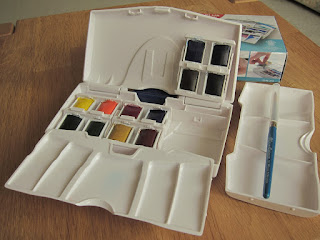
The Cotman Pocket PLUS

Having already mentioned the shortcomings of the Cotman Sketchers' Pocket Box (limited mixing palette space and the risk of losing the pans), the slightly more expensive Pocket PLUS appeared to have addressed these issues -- so I thought I had better investigate for myself. The packaging of my example probably dates from around the time that Winsor & Newton were acquired by ColArt, as the half pans were wrapped in cellophane only.

Upon opening the box, it is clear it is different from the more compact Sketchers' Pocket Box. For starters, it is made out of a thinner plastic and does not fit together as snugly as the Sketchers' Pocket Box. The white case resembles a clam shell and is hinged with a section of blue plastic, and thus does not open flat like the Pocket Box. Inside the lid are two separate mixing palettes, one of which will clip on to the base of the box. There are three cassettes made up of four half pans that snap into the base of the box. A short-handled Cotman No. 5 brush is also supplied.

The cassettes will take either four half pans or two whole pans -- but only Cotman, Winsor & Newton or Daler-Rowney pans appear to fit. (Other brands are too big.) This may be an issue if you like to fill empty pans with tube paint. There are lugs in the base that the cassettes snap into to hold them securely, but of course there is still the problem that the watercolour cakes may not be well-attached to their pans!

The Cotman half pans mine was supplied with were Cadmium Yellow Pale Hue, Cadmium Yellow Hue, Cadmium Red Pale Hue, Alizarin Crimson, Ultramarine, Cobalt Blue [sic], Sap Green, Viridian Hue, Yellow Ochre, Burnt Umber, Burnt Sienna, and Chinese White. The inclusion of Cobalt Blue is a little strange as this colour should be a mix of Ultramarine and white, rather than the more expensive pure pigment. (I would replace it with Cotman's Intense Blue, which seems to be a well-regarded paint.) Also, there is not much of a difference between Cadmium Yellow Pale Hue and Cadmium Yellow Hue...

There is certainly more mixing area available: up to three times that of Sketchers' Pocket Box in fact, as the lid can be used if you can manage to get it flat. I find the blue plastic hinge annoying, as it prevents the Pocket PLUS from lying flat on a table -- but this is just me, as it is designed to be held in the hand and the hinge is supposed to be a finger hold!

This is a better choice of watercolour paint box for plein air painting, notwithstanding the comment about loose pigment cakes in pans.

Tuesday 18 July 2017

Rosacea

Preparations for a wonderful holiday in Italy have delayed this month 's posting. While not of a creative nature, the subject is nevertheless an important one for those who have to deal with it on a daily basis.

Rosacea is a skin condition that is often mistaken for acne vulgaris (the bane of many a young person going through adolescence), but it is different in a number of ways. For starters, it is not about raging hormones, blocked pores and over-production of sebum. Almost the opposite, as it tends to be a condition in older people. It is also limited to the face and eyes, whereas acne can also be a problem on other parts of the body, especially the back.

Although the exact causes of rosacea are not well understood, and a number of explanations can be found on the internet, there seems to be a link between age and genetics. Fair-haired and pale-skinned people into their 50s and beyond are more likely show symptoms. These may include swelling of some parts of the face, redness of facial skin, the appearance of tiny veins on the face, spots resembling acne, growth and swelling of the end of the nose, and redness in the eyes.

Some symptoms (types) will come and go in response to triggers such as stress, weather, temperature, chemicals and even diet, but others such as spider veins and swelling of the nose cannot be reversed without medical treatment. Rosacea sufferers will try to control or minimise their triggers based on a process of trial and error, to prevent uncomfortable and/or embarrassing flare-ups. Some products (e.g., cosmetics) can be used to hide some of the effects of rosacea.

I was diagnosed with rosacea in my mid-40s. I had endured acne since becoming a teenager, and had managed to control it for the most part, but I was never entirely free of it in 30 years. Perhaps it was in my genes that I would develop rosacea; but I think that my long-suffering face had been subject to too many acne creams, gels, lotions, and soaps. Not to mention topical antibiotics, unprotected sun exposure and 18 harsh Canadian winters!

It seems that I get occurrences of most of the the rosacea types, thankfully not too severe. I have since had low-dose treatment with Accutane, and undergone rhinoplasty to improve the state of my nose. I use Metrogel fairly regularly to help control any inflamed areas.

I try to avoid getting any sort of product on my face, as this generally causes irritation and inflammation. I have to be especially careful about shampoos and skin cleansers. (Anything with a fragrance is usually trouble!) In the summer, over-exposure to the sun is a problem, so it is a juggling act to find a gentle sun screen coupled with a gentle cleanser to remove it afterwards. I am still trying to work out which ingredients are most irritating...

When all is said and done, there are many people worse off than myself: I will never look that great -- especially up close -- but it is not a life-threatening condition.

Tuesday 2 May 2017

Film or digital?

A few years ago, I assumed that things had run their course and digital photography had become the norm. Indeed, it is an accepted part of everyday life, when most mobile phones now come with a usable digital camera. Film is something that some professionals and some enthusiasts still use, but it has all but disappeared from the high street for everyday use. Nevertheless, a few younger people are discovering the creative possibilities of film, and it seems to be enjoying something of a revival.

I used film regularly between 1970 and 2007. I bought my first digital camera in 2005. Although I was not initially thrilled with the idea that a computer was a useful photographic accessory, it has since become an essential storage device and tool. Could I imagine a time when I might abandon digital photography in favour of film? An interesting question.

Although I enjoyed the discipline of using and processing film, it was not without its frustrations. There were a number of risks and uncertainties, any of which could spoil or even ruin the results. Setting aside the basics of getting a good exposure and capturing the subject, on various occasions I have been let down by poor film loading, camera failure and human error during processing. But it is mighty satisfying when it all comes out well. I always get a buzz from doing something creative with my hands.

In comparison, digital photography is all about technology. Even the most basic digital camera will do nearly everything for you -- all you have to do is point the camera in the appropriate direction and press the button! You can immediately see whether the camera has captured the image you intended, and if you are not happy you may be able to have another go. This also serves as confirmation that the camera is functioning as expected. Furthermore, you are not limited to about 40 exposures before you  need to change media. A memory card can hold hundreds of images, even video. (But battery life can be more of a consideration...)

So, digital photography sounds wonderful. I wish I had had a point-and-shoot digital camera when I was growing up! However, there is one worrying deficiency that no-one seems to talk about. By its very nature, film (with the exception of Polaroid) results in exposed negatives and positives (slides). This is the raw data. From these, prints and scans can be made (with additional processing). But more significantly, a person can look at a negative or slide with the naked eye and know that it is a photographic image.

In contrast, digital photography generates images in the form of digital data files. These require some sort of digital device to read and decode the digital data. The problem is, technology moves forward relentlessly. SD memory cards and JPEG format files are common in 2017, but what will the future be like in 40, 30, or even 20 years? Can we expect to be able to read an SD card in 20 years, and will we still be able to decode a JPEG file?

The point is, the long term survival of our digital memories is at risk. There is still currently no digital archival media available for consumer use that is guaranteed to be good for 40 years. No digital equivalent of the slide or negative. So if we fail to keep migrating our digital data to the latest technology, there is a real risk that it will become unreadable and therefore lost. (Even a digital mass storage device is subject to physical damage.) The best we can do is to make prints of our digital images and store them carefully. Which, sadly, is how it was 50 years ago, so things have not really changed that much!

And to answer the question I posed, despite the archival problem, I find digital photography too convenient to forsake it completely for film. When I get to retirement, I dare say I will be tempted to dust off my old 35 mm cameras to see whether they still work, and to see whether I am still capable of processing film. Here's hoping that I will still be able to buy new film and processing chemicals when the time comes...

Saturday 1 April 2017

Canon EOS digital colour

Last summer I treated myself to my first digital single lens reflex camera (DSLR). (A Canon EOS 100D for those who are interested in such things.) It was somewhat of an impulse purchase, as the plan was to shop for a laptop -- so I think I must have got distracted...

As with my earlier rambling blog postings about (compact) digital camera colour, I was interested to see what the default colour of a DSLR would look straight out of the factory, so to speak. This first image shows the results of "right out of the box", on the Automatic ("A+") setting.

My assessment of this photo is that -- like the output of the compact camera previously -- it is contrasty, over-saturated and too blue. Look at the reflection in the window in the background, and those flowers beyond the wall should be more purple. (But I appreciate that there are those who will prefer it this way. Life would be dull and devoid of variety if we all liked the same thing!)

Predictably, I felt that the colour reproduction could be improved. As the settings on modern EOS DSLRs are a little different from what I was used to in PowerShot compacts, I referred to this article for some suggestions as to what I could change and how it would affect my images. If it isn't already obvious, I am a believer in Straight Out Of Camera (SOOC) -- getting the camera settings as close as I can, so I don't have to waste time in front of the computer fiddling with stuff later!

Having experimented with the Custom Color settings of the Canon PowerShot S95, I was surprised to find that EOS DSLRs only offer settings for Picture Style, Contrast, Sharpness, Saturation, and Skin Tone. (Plus the usual adjustments for Auto White Balance (AWB).) The RGB adjustments of the S95 are absent, but the EOS allows seven steps of adjustment compared to the S95's five.

Following the Digital Photography Review article, it looked as though either the Faithful or Neutral picture style was the one most suitable for me. Contrast and saturation needed to be reduced -- par for the course in all digital cameras, it seems! Therefore, after a little testing in Program mode, I set Neutral picture style, Sharpness to 5, Contrast to -3, Saturation to -1, and left Color Tone as it was. This is denoted by (N,5,-3,-1,0). I was quite pleased with the results when I went on holiday with the camera in September 2016. However, I did think that the contrast was a little higher than I wanted and the colours were still slightly too saturated.

I subsequently read elsewhere that setting Sharpness beyond 3 can cause sharpening artefacts on images, so I reduced this to 3. In late December (UK) 2016, I tried the Faithful picture style: (F,3,-4,-3,0). I decided that it did strange things to reds in particular, especially in winter low light conditions. Canon's documentation seems a little vague, but I think the idea is that this picture style needs to be used under a (controlled) light source of 5200K to reproduce faithful colour.

It seems that many DSLR photographers "shoot raw", and don't worry too much about camera settings -- preferring to spend time with photo-editing software. Fair enough. It is more of an issue for those who use DSLRs to shoot video. This is how I came across the Prolost Flat setting: (N,0,-4,-2,0). Apart from the sharpening, this was near enough what I had decided on, so it was reassuring that someone else is extolling its virtues.

The second image had the camera set to (N,3,-4,-2,0). I am still working on the Auto White Balance settings, but this photo used (A8, G2). (I was surprised that I had to set Amber compensation so high.) It may not "pop", but I feel this is a better representation of what I experienced at the time, and the colour balance and saturation does not jar.

Wednesday 1 March 2017

Modelu figures

These are miniature figures -- in the British model railway scales of 4 mm to the foot (1:76.2) and 7 mm to the foot (1:43.5). The larger scale figure is on the right, with two more 4 mm scale examples in bags behind. What is interesting about them is that they are a result of current technology, and that the standing figures should be identical to each other apart from size.

Not so long ago, the quality and accuracy of a model/miniature figure was in large part down to the skill of the sculptor. Normally, a master figure would be painstakingly modelled, and from this would be produced a mould to cast a number of replicas -- traditionally in white metal or pewter. Skill and care is then needed in the casting process in order to avoid defects in the resulting figures, such as excess flash, pitting and heavy mould lines. Even the best cast figure will need some careful attention with a small file to get it ready for painting.

These Modelu (pronounced "Mo-Del-Ee", I understand) figures change the game. For a start they are not cast or injection-moulded. They are in fact 3D-printed in plastic. (Look at the near scale appearance of the brim of the bowler hat.) This means that mould lines and casting defects are a thing of the past. Hurrah! Painting should now require very little preparation. (Although having said that, I notice that the light has caught the tell-tale characteristic of 3D printing in the figure on the right: the contour marks on the chest and the ridging on the bowler hat.)

The other significant difference is that the hand-sculpting process has gone, for better or worse. The casting master is now a real person, so to speak. Laser scanning of someone dressed in character, generates some computer data, which can then be scaled for model use and printed on a 3D printer. This is, of course, a much quicker and less labour-intensive process than hand-sculpting. And it is relatively easy to produce figures in different scales from one set of data. In the traditional casting process, a new master is needed for each scale.

It doesn't take much thought to realise that it should now be possible to create a model figure of oneself! Indeed, if one is so inclined, the service is available...

Wednesday 1 February 2017

Digital camera colour revisited

I have returned to the subject of digital camera colour as it troubled me that I wasn't giving a true representation of how I normally use and operate my digital camera(s). Custom White Balance is all well and good, but only useful when one is in no hurry to get that particular shot. I seldom go somewhere with the express purpose of taking photographs, so a camera has to fit in with my activities and not hold things up.

Here are two images taken a few minutes apart to illustrate the (subtle) differences in colour that can be achieved by changing just a few settings (if the camera has these capabilities). The first is made with the camera in full Auto mode; the second by taking more control of the exposure (reduced by 1/3 EV), the colour settings, and the Auto White Balance. Note how generally blue and contrasty the first picture is (windows and barge boards in the background), with a redder door (on the left) and brickwork (on the right). The second photo looks closer to true to life to me. (I say closer, because the grass actually has more yellower patches in reality. I put this down to the way the sensor interpolates pixels...)

My general criticism of digital camera colour is that it is "overcooked" by the manufacturers, as that is what they believe that most consumers prefer. (This may explain why some enthusiasts have returned to film.) Where I have the facility to adjust things on my cameras, I solve this by reducing the colour saturation and contrast to suit. As with sustained loud noise, over-saturated colour becomes tiring after a while -- like a badly-adjusted TV.

I follow Ken Rockwell's advice and usually set my camera to Program mode, which I use for the majority of my photos. This setting allows me to adjust the exposure and ISO if I need to, but most of the time I am happy to let the camera choose most of the parameters for me. This includes White Balance, which is normally set to Auto. (Note that Ken Rockwell is an artist, and likes his colour saturation set to bonkers for his images -- what works in sunny California may not have the same effect in the frequently overcast and more northerly UK!)

The trick then -- if necessary and the camera controls permit it -- is to adjust Auto White Balance (AWB) to give pleasing results in daylight. The correct White Balance (whether white objects are truly white) depends on the colour temperature of the light, and it can change according to the time of day and the weather. Digital cameras often have a number of fixed settings that can be used, but it is more convenient to get the camera to set this automatically. However, I have found that the AWB setting can often result in a slight colour cast, especially on older cameras.

Cameras with enthusiast features usually have a means of adjusting the colour bias in the Auto White Balance.  A blue cast can be corrected by increasing the amber level and a magenta cast can be corrected by increasing the green level. Conversely, amber can be reduced by increasing the blue level and green can be reduced by increasing the magenta level. Blue and amber are two ends of one setting, and magenta and green the other. The two settings can be used in combination.

To adjust the Auto White Balance, I choose a daylit subject and first use Custom White Balance to take a photo with what should be the correct balanced colours. I then change to AWB and take a similar photo. I now compare the two photos using a computer monitor and decide which AWB settings need to be changed, make the adjustment(s), and then repeat the photo-taking process until I cannot distinguish between the Custom and AWB images. I then make a note of the AWB correction, e.g., (A4, G2) for future reference. This can be a slow process, but I feel that the improvement in image colour is worth it.

For the record, in the second photograph my Canon PowerShot S95 was set to Custom Color with Contrast = -1, Saturation = -2, Sharpness = +1 and AWB (A5, G3).

Sunday 1 January 2017

Royal Mail commemorative stamps?

This month's posting shows a collection of Great Britain (GB) Christmas stamps -- both the modern self-adhesive types; and the bigger, older gummed types. (Proper Christmas stamps!) A couple of decades ago, I would have listed stamp collecting as one of my pastimes, but in the mid- to late-1990s I lost interest. I had been a collector of both Canadian and GB postage stamps. I suppose I had other things to fill my free time. I was also getting irritated by the more frequent issues, and the bigger sets of commemorative stamps. It felt as though Royal Mail in particular were exploiting the collectors.

Jump ahead to late 2016, and the postage stamp world looks a different place. Self-adhesive stamps for everyday use have replaced the ones that you had to lick, and any form of postage stamp on mail to the home is a fairly rare event. Except of course for Christmas, when people still trouble themselves to send cards and Season's Greetings. This is the only time of year that I receive stamps other than the usual definitives. Even then, they are mostly definitive-size Christmas stamps, so nothing really to catch the eye.

This got me thinking. Why does Royal Mail still apparently issue dozens of commemorative stamps if no-one, except for collectors, actually sees them? What is the point? (Apart from screwing more money out of collectors, of course, which the collectors themselves realise.) Why do these stamps never seem to be marketed to the general public? In the past, it was a way of drawing attention to notable events and people, or promoting something about (Great) Britain. Have the management decided that this publicity is an unnecessary cost?

It probably doesn't need an MBA to discover that stamp collecting as a hobby is not what it used to be, and the cash cow that it might be now is going to fade away in the next decade or two, as collectors drop off their perches. I get the feeling that little young blood is coming into the hobby -- I suspect that the likes of mobile phones and social media offer a more instant gratification.

While I am criticising Royal Mail, why is it that they cannot cancel a stamp and put a (legible) postmark on an envelope? Surely with modern technology it is easier than ever, but I receive a noticeable proportion of mail with uncancelled stamps. On the day of writing, I had a card delivered and the envelope was in pristine condition with no clue as to where it had come from or when it was posted.  What is the use of that! And yet, Royal Mail have developed devices on stamps to deter their re-use. (I appreciate the concerns about forgeries.) Wouldn't it be better to ensure that the stamps are properly cancelled (and postmarked) in the first place? Like it used to be done in days of yore?

Despite the criticisms, Royal Mail still do a good job of delivering post straight to my front door in all weathers -- and long may it continue. I will try to support the UK's postal system as best as I can, even though I probably only add to the woes at Christmastime...

Best Wishes for 2017 to everyone!