Monday, 1 July 2019

Back to butter

What one now spreads on the breakfast toast seems to have become controversial! When I was young, my whole family used butter. Margarine was only used for baking. Later, as my mother became aware of her high cholesterol condition, she used low-fat spreads and most of us followed her example as we didn’t mind the taste and the spreadable convenience was appealing. Also at that time, butter was demonised for being less healthy and saturated fats were considered to contribute to high cholesterol -- so we thought we were doing ourselves a favour.

In the early 1990s I had Lurpack Spreadable on my toast and sandwiches for a couple of years or so, but eventually I settled on Flora spread and used that almost exclusively until June 2019. Given a choice, I prefer the taste of butter and with increasing years I try to think more carefully about what I am consuming.

Well, I probably would have continued to be a loyal Flora customer for many more years, but in the spring of 2019 the (new) manufacturers changed the composition of Flora Original. (Huh, original?) The 45 percent fat content with buttermilk changed to 70 percent fat and 100 percent plant goodness. (Trying to get the vegan vote?) The taste changed subtly — to more like butter — and I found it less easy to spread straight from the fridge. When I looked at the list of ingredients I was surprised to see that palm oil was mentioned. (It turns out that the old recipe used it too.) So why wasn’t I just using butter?

I started to query the Internet about low-fat spreads, saturated fats and butter. I was intrigued to find that the link between saturated fats and cholesterol was inconclusive. At least one person who seemed to be well-informed and knew the science, said that butter is a more natural product than processed low-fat spreads, and is likely to be better for you if the cows have been grazed on grass. Palm oil gets a really bad rap for what the expanding plantations are doing to the rainforests of south east Asia — and by extension, to the planet. Some people are not very happy about this, especially the impact that it is having on the gentle orang-utan.

Therefore, I decided that I was going to support UK producers and reduce my consumption of palm oil. (Can I hope that this might also save valuable British farmland from naughty politicians and developers?) I am back on butter now, but I won’t rule out the possibility of another low-fat spread if it scores well on the taste and ingredients, and the science checks out.

As for saving the planet, eliminating Homo sapiens seems to be the only long term solution! We have been gradually exterminating all other species for hundreds, if not thousands of years. (We have not done so well with our own kind either.) It must be in our genetic makeup to destroy any threat or competition. So when is the next big asteroid strike due? It worked for the dinosaurs...

Saturday, 1 June 2019

The last Sunday HST from London to Carmarthen?

On Saturday 18th May 2019, GWR (formerly First Great Western) ran its last full-length High Speed Train services, thereby ending nearly 43 years of frontline service of this remarkable stock. Although I would admit to being a railway enthusiast, I am mostly out of touch with the current scene and would have been oblivious to this event unless I happened to catch it on the news -- when it would have been too late!

However, it turned out that a friend of mine regularly drops off his copies of The Railway Magazine, and I read the April 2019 issue which had a brief comment about the last day of HSTs on the Great Western. Since I live within earshot (when the weather obliges) of the Great Western main line through the Vale of White Horse, and HSTs have been a familiar local feature for nearly as long as I can remember, I felt I needed to make the effort to witness some of the final runs. This is what I was able to see and record. (I should also note that this is a place where HSTs were in their natural element, working at speeds they were designed for.)

Thanks to the resources of the Internet, I was able to discover (a) what services would be diagrammed for HSTs on which day, and (b) when they were likely to come through. Luckily, I had remembered to check things on Saturday 11th May: there was still a week to go. Indeed, no HSTs were scheduled through the Vale on this day, but there was a Paddington to Camarthen (and return) service the next day. The estimated passing times were most convenient, it was a beautiful spring weekend, and I had no other hard commitments. This sounded like a plan! The site www.125group.org.uk provided me with information about general HST diagrams (which train services an HST set would operate on a given day), and the site railforums.co.uk had more up-to-date news and comments about the specific HST sets and the services they would be operating.

Therefore, these images are the result of my two excursions on Sunday 12th May -- less than a week to go before the last scheduled HST services. I chose the two foot crossings near me, where the public right-of-way crosses the mainline. (I was not somewhere I was not supposed to be.) Remarkably, despite the crossings being well-used, no-one else had joined me to watch these trains go by (unlike the following Saturday), so these photos must be unique. The first shows the 11:33 service (train 1B28) from London Paddington to Carmarthen, with the retro-liveried power car 43185 trailing. The second photo shows this same HST power car leading on the 16:55 service (train 1L90) from Carmarthen to London Paddington. The last image is the trailing HST power car 43009, passing the site of Williams Grand Prix Engineering to the right, out of shot.


I will miss these trains. I have always liked them. There was something thrilling about hearing the approaching, distant throb of two power cars at speed, working hard, getting closer and closer. And then the explosive roar as the leading power car passed by, followed by the whoosh of eight Mark 3 coaches, and then the roar again of the trailing power car. As the sound then rapidly faded into the distance, the tranquility of rural Oxfordshire would return and birdsong could be heard again. All that remained was the waft of diesel exhaust. Magic!

Wednesday, 1 May 2019

Still made in England

My mother was a careful shopper. That is to say, she was careful with her money and was loath to spend it on something that she thought was not of the appropriate quality. I remember shopping expeditions with her at a tender age and recall how she used to check seams on clothing for signs of poor finishing, and also look at the label to see where it was made. In those days, Made in England was usually an indication that the item would stand up to reasonable wear and tear.

Go forward at least four decades, and mass-consumer items proclaiming that they are made in the UK -- especially clothing -- are not as common as they used to be. But perhaps we have been conditioned to think and expect that all the things we can still buy in the shops are mostly produced overseas? (Except food, I hope!)

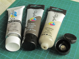
Recently, I convinced myself that a tube of Buff Titanium acrylic paint would be a useful acquisition, and decided that I would try the repackaged Daler-Rowney System 3 range. I knew that Broad Canvas in Oxford stocked the System 3 range, and I was able to drop by one day and buy a tube. When I had a chance to examine the packaging more closely, I was a little surprised to see that it said Made in England.

Like Winsor and Newton and many other brands, I had assumed that the pressure to off-shore manufacturing was irresistible and a sign of the times, and the revised System 3 packaging was a consequence of that. So it was unexpected to find that Daler-Rowney acrylic paint is still made in the UK, and my assumption is false that only expensive bespoke or luxury items carry British branding.

The tube itself shows that some thought has gone into its production. The old metal tube has been replaced by a clear plastic squeezable tube. This means that you can see how much paint is in the tube, and what colour it is. The cap is screw-on as before, but has been redesigned to have a flip top. This should make it easier to squeeze out small amounts of paint and avoid clogging up the screw threads with paint! The only slightly negative point is that the quantity has been reduced from a more generous 75 ml to the standard 59 ml (US 2 fl. oz.) format that other brands use.

Labelling is clear and a transparent wrapper around the top of the tube shows the colour name, colour number, lightfastness, opacity, and pigment composition. Plus the usual bar code, and a product code?

I have not had much opportunity yet to compare and test the paint. It happily mixed with Winsor and Newton Galeria Green Gold as expected and produced no surprises. The consistency of the paint seems to be the same as it was in the metal tubes, which is a medium viscosity. (Ideal for dry-brushing, but too liquid for impasto work and too thick for air-brushing straight out of the tube.)

The Daler-Rowney System 3 acrylic range comes in 60 colours -- including metallics and fluorescents -- so it appears to be an alternative to the W&N Galeria line of acrylic paints, and is similarly priced. Furthermore, a limited selection of colours is available through Ryman's the office suppliers. (Where I got the Raw Umber also shown above from.) I like the convenience of the flip top cap, so I suspect that I may be buying additional paints from this range in future if there are other colours that I can use.

Monday, 1 April 2019

Para's Progress 3

It has been nearly two years since the last update on the painting of the Airfix 1/32 scale (54 millimetre) Second World War British Paratrooper figure. I hinted back then that things were about to get rather complicated, and so it is. In terms of the uniform and the equipment, I don't think I could have chosen a more challenging subject. Talk about jumping in at the deep end!

Having done a little bit of Internet research, I soon discovered that one distinctive feature of the British paratrooper is the Denison Smock, which is worn over the standard British issue battle dress. From a model painter's point of view, the difficult bit is that the smock is in three colours -- two of which are a seemingly random camouflage pattern. The base colour of the smock is of light or mid-olive green and it is covered with broad brush strokes of reddish brown and dark green. Getting this to look convincing and avoid equipment and webbing would be the tricky bit.

The photos show my progress to date. I have shied away from completely ruining the figure with the camouflage pattern yet: that will be a later instalment! The larger areas of colour have been painted using a Pro Arte Acrylix No. 4 round brush, and I have started on the more detailed bits such as the scarf, helmet and puttees. There will be more fiddly painting to come, that's for sure. Painting sessions have been limited to about an hour at a time on weekends when time permits (and the motivation holds up).

I already knew about the errant patch of olive green on the figure's right hand, but having examined the photo closely, it looks as though I have also been careless when painting the helmet and have got some green on his nose! So some touching-up will be needed at the end. One of the challenges of this method is that a thin paint layer intensifies in colour once it has dried, and it can be difficult to see a spot of paint in the wrong place while it is still wet.

Paints used recently have been Liquitex Medium Viscosity Raw Umber and Winsor & Newton Galeria Green Gold for khaki; Galeria Yellow Ochre and Ultramarine for olive green; Galeria Olive Green and Yellow Ochre for the green helmet; and Daler-Rowney System 3 Buff Titanium and Galeria Green Gold for the puttees. Incidentally, Galeria Olive Green is much bluer than I expected -- most green olives that I have seen are a yellowish-green, or a brownish-green. (This probably explains why I struggled with the colour of the khaki trousers previously.)

Even at this stage, it is showing that the grisaille technique has been worth the effort, and has brought out the detail in a subtle way. Look at the sculpting of the Denison Smock, especially in the arms -- quite remarkable in something that was sold as an inexpensive toy soldier more than 40 years ago! So this is encouragement for me that I am not wasting my time, and to keep going...

Friday, 1 March 2019

Canon EOS digital colour revisited

This month features a couple of photos taken with my DSLR about six months apart in 2018 in Corfe Castle, Dorset. Nearly two years ago -- in April 2017 -- I wrote about my experiences with the colour settings on my Canon EOS 100D DSLR camera, so this is a follow-up to show how I'm getting on.

Both images used the slightly sharpened Prolost Flat setting that I had settled upon two years ago. (I automatically apply a modest amount of in-camera sharpening as I am a believer in Straight Out Of Camera [SOOC].) Therefore, this suggests that I am still fairly happy with these settings.

Almost all the time I have the colour balance set to Auto White Balance (AWB). This lets the camera adjust the colour balance to suit the lighting conditions, and mostly it seems to do a good job. However, I suspect there may be a tendency to make images more blue and red than I think they are. Fortunately this is not a problem and it can be compensated for. The EOS 100D allows the user to set colour biases for both amber and green (conversely blue and magenta) -- getting the biases looking right is the hard part!

There seems to be no shortcut to finding the ideal settings. I start by adjusting the blue balance with two notches of amber, i.e., A2. Then I take photos on this setting and decide whether the results show too blue or too amber a colour cast. If I am not satisfied, I will make another adjustment and repeat the process until I feel things are looking about right. Then I will go through the same procedure for green... Currently I am using (A4, G4) on the EOS 100D. (Possibly coincidentally, I am using similar AWB settings on my compact Canon PowerShot S95.)

Most Canon digital cameras appear to have a Custom White Balance setting. This works well and is easy to use on compact cameras, but is a little awkward and less useful on the EOS 100D. It is necessary to take a photo of a suitable white target in the appropriate lighting conditions, and then go through the menu to select this photo as the WB to use. But by the time this is done, the lighting may have changed! Also, I was surprised to find that the AWB biases still seemed to be having an effect if they were set while using CWB, so perhaps I was not doing it correctly?

Friday, 1 February 2019

Sennen Cove beach at sunset

Recently I happened to be talking to one of the rare people who actually take time to read this blog (occasionally), and they said something along the lines of: "[Almost] no-one reads your blog so you should post some of your paintings -- no-one will see them!" Point taken, although not exactly encouraging... (Apparently, I post mostly rants?) So here is one example of a painting.

It is what I consider to be my eighth (beginner's) painting and was completed last summer during a very warm week off work. It is largely based on a photograph that I took on the beach at Sennen Cove in West Cornwall, England in September 2008. (This was my first visit to Sennen Cove -- I have been back many times since, as it is such an amazing location in all weathers and times of the year.) I suppose it could depict a beach in a number of places on the planet in all honesty, as nothing particular shouts Sennen Cove.

I was thinking: when one's eye is drawn to a picture, it is due to the subject matter, or the composition, or the lighting, or the colour, or the artistry, or some combination of all of these. Not -- ooh, I wonder whether the painter used "Brand X" paint, or "Brand Y" brushes? So I can't really understand why people spend so much time discussing (arguing?) the merits of different brands, as it is the final product that matters. Whatever works for you. (In the case of watercolour, the paper itself is the most apparent feature. How many people would be able to identify the manufacturer by looking at a finished painting? Would they like the painting less if they discovered that it was painted on paper that they considered to be inferior?)

Time to nail my colours (paints?) to the mast, so to speak! On the basis of previous blog postings, it would be hypocritical not to say that I used Cotman watercolours. I did -- exclusively. Not that it really matters, but I would have used Intense Blue and Cadmium Red Pale Hue for the sky, Intense Blue, Viridian Hue, Cadmium Yellow Pale Hue and Cadmium Red Pale Hue for the sea; and different combinations of Ultramarine, Burnt Sienna, Burnt Umber and Yellow Ochre for the beach. I can't remember details of the brushes (I have too many), but I'm sure I would have used at least one Escoda Versatil round at some stage, as they work well for me without costing a small fortune.

The paper was Ken Bromley Practice Paper, AKA Fabriano Watercolour paper (cut down to one eighth of an Imperial sheet). This is 130 lbs in thickness, supposedly 25 percent cotton, and comes in a Not surface -- probably its most distinctive feature. I used moistened brown gummed paper tape to help stretch it and fix it to an A4-sized piece of 6 mm thick plywood that had previously been painted white. Ken Bromley Masking Fluid was used for lighter areas in the waves: I had no problem removing it when it was dry. I was fairly pleased with how the painting turned out, although I don't like the regular texture of the paper, and I had to be careful to avoid overworking it. (I find that Bockingford paper is more amenable to my present lack of technique and experience.)

Tuesday, 1 January 2019

The Archie search engine: I was there...

On 11th (some sources say 10th) September 1990, a small team of people from McGill University in Montreal, Canada released what is generally recognised as the world's first internet search engine. It was called archie. The team members were Alan Emtage, (J) Peter Deutsch, Bill Heelan and Mike (der Mouse) Parker. As surprising as it may seem, I used to work with these clever people and regarded them as my friends. But I played no part in the development of archie. Or did I?

My story starts in Montreal in 1986 at a small hi-tech company called MUX LAB, where Peter and I were working as part of a small team of programmers developing a product called ACCESS 36. (I still have a copy of the user manual.) It was both a rewarding and a frustrating experience at times, and after a few incomprehensible management decisions, Peter left to work on his Master's degree at McGill full-time. My time at MUX LAB came to an end in early September 1987 -- I should have seen it coming...

About the same time, the post of System Manager at McGill's School of Computer Science had become vacant, and it was offered to Peter -- which he accepted. Not long afterwards, knowing of my lack of employment, Peter asked me whether I would like to work for him as a (Unix) systems administrator. As the saying goes, the rest is history! I was delighted to accept, although I knew it would be a steep learning curve. Peter was already assisted part-time by Luc, whom I also knew from my stint at MUX LAB, and who was also working on his Master's degree. At that time, the School of Computer Science was located on the eighth and ninth floors of Burnside Hall on McGill's downtown campus.

The first few months were challenging but by early 1988 Peter was looking to expand the team. If I remember correctly, Bill came recommended by a friend of mine (Stephen) at Concordia University. One of my earliest memories of working with Bill was helping to set up and configure a new Sun 3/280 server by booting it from a remote 1/2" tape drive. Based on Bill's recommendation to Peter, Wanda joined the team in late spring or early summer of 1988. And by the summer, Alan had swelled our ranks -- although I think it might have been earlier as he shared an office with Luc, separate from the full-time staff.

One probable reason for the relatively sudden increase in staff numbers was that The School of Computer Science (SOCS) was to be relocated to the McConnell Engineering Building, into newly refurbished spaces on the second and third floors. The SOCS system staff were responsible for all the computers, serial cabling and most of the network cabling. So it turned out to be a very busy summer running and terminating cables, getting everything ready, and then moving everything into new rooms and offices.

By 1989, we were settled in to Engineering and the pace of life seemed to slow down to more of a routine. Frankly, and in retrospect, we were over-staffed for the size and complexity of the School at the time. But they were ideal conditions for what was to come.

As has been related elsewhere, Alan had accumulated a number of large files listing the contents of Internet download sites. (I have a feeling that I grumbled when I discovered that some of them had appeared on the server milo that I used to maintain!) In time and quite logically, this transformed into the archie project, and then took off. Peter announced that we were welcome to volunteer to work on the project, but I remember thinking that most of the (interesting) programming was already underway and I didn't think I could contribute anything useful. (Where was the crystal ball when you needed it, eh?) Bill's desk was adjacent to mine so I was aware that he was working on the user interface, and was inspired by the VMS shell that he had used at Concordia. I remember hearing Alan talk about memory mapping as a way to speed up database access. Mike (Mouse) was based in McCRIM a couple of floors above, and was our friendly local Unix guru who would drop by regularly and offer advice.

So I made no direct contribution to archie that I can remember. However, I did once solve a problem that was causing the archie server (a Sun 4/280 running SunOS 4.1 I think?) to crash fairly frequently while under load. I believe it was Luc who came to see me with error messages from the server log files. It looked as though it was related to the serial ports. This rang a bell: the fix was to physically disconnect the DB25 plugs (still cabled-up to the patch panel) from the serial ports on the server. I then heard that this seemed to help with extending the uptime...
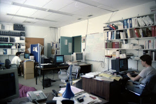
This all happened long before the arrival of consumer digital photography. I had taken a few photos of the work environment on colour print film, and a couple of the most relevant appear here. (Apologies for the general low quality: an inexpensive all-manual SLR and matching lens.) The top picture shows an out-of-focus (oops) Bill (L) and Peter (R), and was taken around the spring of 1988 in the old Burnside Hall office. The photo of Wanda (L) and Bill (R), taken from my desk, dates from the summer of 1991 and shows the office where a good proportion of the archie discussion and development took place. Alan would sometimes use the desk in the centre of the photo as his office was next door. (I thought I had a photo of Alan, but nothing has come to light yet. I'm fairly sure that I didn't take any pictures of Mouse.)

My former colleagues, wherever they are now, may remember things a little differently -- some of the events mentioned happened more than 30 years ago, and memory can be unreliable. I felt it would be useful to record a little more detail about the background and context of the creation of archie as I still recall it. (Some of the references I have found about it are misleading or inaccurate!) I am of course proud of the achievement of my former sys. admin. team members: at the time, none of us suspected how it would change the world!